Visualizing Content Cleanup Results
Visualizing Content Cleanup Activities
By creating visualizations and displaying them as dashboards in the Visualizer, teams can present progress and results of content cleanup activities to stakeholders. Dashboards can be created from scratch in the Visualizer. Alternatively, dashboards that come standard with Cognitive Suite can be cloned and modified to communicate your desired outcomes.
Modifying Dashboards
Modify dashboards to maximize the effectiveness of your results presentation to stakeholders. Dashboards can be modified by adding, editing, or deleting visualizations.
Adding Visualizations
To add a visualization to a dashboard:
From Dashboard, click Edit
Click Add
Either:
Select a visualization from the list OR
Click Add new Visualization
Select the desired visualization type
Select the index the new visualization will apply to OR
Select the Saved Searches Filter to be used for the visualization
From Data, add Metrics and/or Buckets, if desired
Metrics add aggregation to the data within the visualization
Buckets enable splits that further refine the visualization
Click Apply Changes (the play button icon) to preview added metrics and/or buckets
When satisfied with the visualization, click Save
Give the visualization a name
Click Confirm Save
Hot Tip
When adding a new visualization to a dashboard, note that it will appear at the bottom of the page. Scroll down to locate the new visualization and drag it to the desired place within the dashboard.
Editing Visualizations
To edit a visualization on a dashboard:
From the dashboard, click Edit
From the visualization you want to edit, click the gear icon
Click Edit visualization
Make your desired edits
Click Apply Changes (the play button icon) to preview your edits
Do one of the following:
To modify the visualization across all dashboards:
Click Save
Click Confirm Save
Return to the dashboard and observe the visualization is updated
Click Save
To only edit the visualization for the current dashboard:
Click Save
Toggle on Save as a new visualization
Give the new visualization a name
Click Confirm Save
Return to the dashboard and click Add
Search for and select the newly saved visualization
Close the Add Panels fly-out
Scroll to the bottom of the dashboard and confirm the visualization is added
Remove the previous visualization by following the steps to delete a visualization (below)
Drag the newly added visualization to the desired location on the dashboard
Click Save
Click Confirm Save
Deleting Visualizations
To delete a visualization from a dashboard:
Click Edit
From the visualization you want to delete, click the gear icon
Click Delete from dashboard
Hot Tip
To avoid accidentally removing visualizations from other dashboards, Shinydocs recommends deleting visualizations from the dashboard only, not from the Visualize tab.
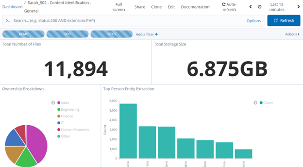
Fig. 1: A sample dashboard including metric, pie chart, and column chart visualizations